Case Study | Globality
UX Framework
Overview:
Globality is a comprehensive marketplace that effectively bridges the gap between individuals seeking specific services and the providers who can meet their needs. A well-designed platform allows users to effortlessly compare various projects, taking into account crucial factors such as budget, timeline, and any unique requirements like NDA or insurance. In response to user feedback, our dedicated product team undertook a meticulous redesign process to enhance the platform's usability and accessibility. By implementing a new framework, we have successfully integrated multiple insights into a cohesive architecture, resulting in a more user-friendly interface that allows for a seamless experience and increased access to valuable insights.
Defining the Problem
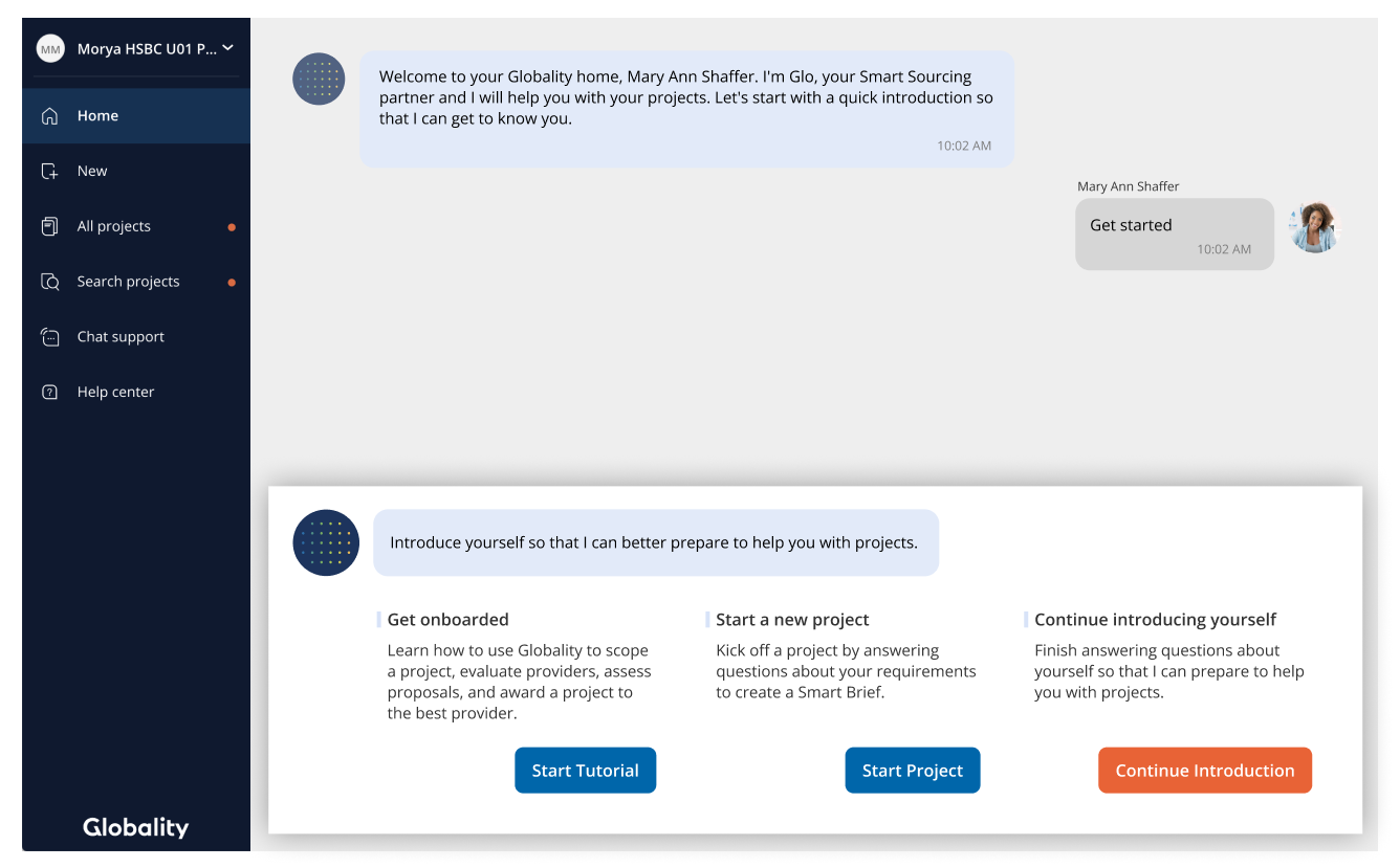
Home Navigation
The home page navigation appears when a user logs in. The Globality logo is currently at the bottom, but it would be better if it was at the top and could also lead back to the home page. The purpose of the "New" feature is unclear. All projects and search could be combined. The main navigation options should be separated from the help, support, and settings sections.
Project Level Navigation
The project level navigation appears when a user opens a project. It could benefit from a clear heading to show the user's location. The project name should not be included in the navigation. The excessive use of icons does not add value.


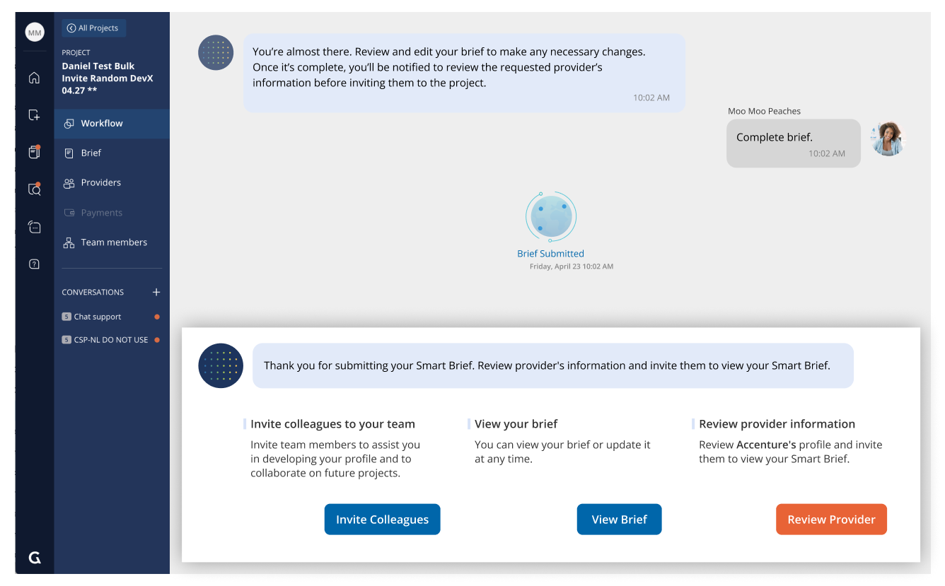
One problem here is that it's hard for new users to tell the difference between the Home and Project dashboard because they look almost the same, except for the menu options and user choices. It's not clear that they're in a different area. The Home and Project dashboard was originally meant to guide users, but it won't work well for other things users want to do. The conversation in the background is a log of answered questions, but it doesn't add much value and takes up a lot of space.

Home Level Dashboard
Project Level Dashboard
Glo is meant to be an AI guide that gives helpful information as users navigate the platform. However, in some places, Glo isn't helpful and the dialogue bubble takes up too much space.


Drafting the New IA

Our goal was to address the mentioned issues and suggest a different way to handle user tasks. For example, we recommend combining all relevant functions (like projects and project search) into one page. This will free up space in the menu and make important features easier to find. Throughout this process, we prioritized the needs and feedback of our customers.

The project's information architecture relied on the dashboard's framework. To address issues like the placement of the project name label, we had to decide on the format of the project-level dashboard. Although the IA remains largely the same on individual pages, the structure within each page is a significant part of the overall vision, which is not the focus of this project.
Design explorations
By using a top navigation bar, the platform has more space to include additional information and design. The main menu is hidden but always available to the user. Important tools like notifications and search can be found on the right side. One advantage of the top navigation bar is that the project name helps users know their current location. Another benefit is that Glo is always visible in the top right corner and can provide extra details when needed.

Home: Default state / Menu collapsed
Home: Menu when expanded

Project: Example of an active ubiquitous tool
The small side menu is simple and takes up less space, but some items in the menu may not be easy to recognize. For example, the branding may not be visible, and objects like projects or providers may be hard to identify unless the user hovers over the icon for a tooltip or expands the menu to see everything.

Left navigation minimized by default

Expanded state
To make the existing navigation menu stronger, a few adjustments can be made. Firstly, the Globality logo should be positioned at the top to have the greatest impact and serve as a secondary home. Instead of 'New +', it can be renamed to 'create a new project' for clarity. Also, considering future co-branding needs, the navigation footer is a suitable place for it.
For the project level navigation, simplification can be achieved by removing the project name, icons, and using the header as a back button. Additionally, a dashboard overview could be beneficial as it presents information in an easily digestible format and helps propel the project towards completion.

Final Design
The new navigation is redesigned to clearly separate different parts: page navigation, user settings, and user actions. The logo is moved to the top to strengthen the company's brand. Not all proposed new IA items were added, but the product team believes there will be opportunities to add those features soon. Each page now has its own title, with the AI assistant on the right and only becoming active when there's something important to say. The Home dashboard now includes both old and new code. Instead of 3 guided actions, there are now 2 suggested actions - a primary and secondary. This change was made to keep the guided experience. Another important update is the recent projects view, which shows a quick overview for users. As the platform grows, more projects will be added, so it's important to highlight them.

Having a project overview is important because it contains key project details and can be easily understood at first glance. Users can now easily identify which project they are in with the new project title bar at the top of the page, which will appear on every page within the project. Removing the project title from the navigation makes the project level navigation menu less crowded and overwhelming, since page icons are also removed. The overview is designed to be flexible and can be adapted as the project progresses. For example, when a proposal is received, project details may become less relevant as all attention is focused on the proposal. Therefore, it may be logical to move the proposal module above the main content.

Side by Side comparison
Old Home

Old Project Dashboard

Redesigned Home

Redesigned Project Overview