

Case Study:Redesigning for Clarity: Restructuring Globality’s Navigation and Project Workflow
Overview
At the onset of this project, our team critically evaluated the user experience of Globality’s platform through the lens of both new and returning users. We asked a simple question: “If I just logged in, what would I expect to see—and what would I want to do next?”
The answer revealed a deeper issue: while navigation existed, it didn’t guide. The layout blurred the lines between action and orientation. For example, “Create a new project” was embedded in the navigation as a link—rather than surfaced as a clear, contextual button. Even more problematic, the logged-in homepage and the project landing screen were nearly identical—creating cognitive friction for returning users trying to reorient.
It became clear that the product lacked spatial and behavioral awareness. First-time and seasoned users were met with the same flat architecture, with little visual distinction or task guidance.
Our redesign efforts focused on restructuring the navigation model and re-architecting the home and in-project landing pages to reflect user intent: whether initiating a new project or resuming an existing one. This meant separating global actions from contextual ones, creating visual affordances for state-based entry points, and clarifying the difference between “home” and “workspace.”
The redesigned experience was tested internally with the leadership team, evaluated by procurement users, and reviewed cross-functionally by PMs, designers, and engineers. The result: faster task completion, reduced misclicks, and a shared understanding that the new structure better aligned with user expectations and real-world workflows.
Problem
Despite offering a range of project features, Globality’s platform struggled with core usability across the primary user journey—from login to project access.
New users faced friction immediately: the expected “Create New Project” action was buried within the navigation as a text link, rather than surfaced contextually on the homepage. This lack of visual hierarchy created confusion around where to start.
Returning users experienced a different kind of friction: reviewing ongoing projects was inefficient due to a card-based layout. While visually clean, the card interface made it difficult to scan key attributes like timelines or statuses across multiple projects. A tabular layout would have better supported cross-comparison and bulk review.
The platform’s AI assistant, Glo, added little value. Its generic prompts (e.g., “Please review your projects”) were redundant and failed to assist with actual decision-making or task flow—contributing to noise rather than clarity.
These issues compounded across the user journey. The transition from homepage → project list → in-project view lacked continuity, producing cognitive dissonance and unnecessary clicks. Instead of guiding users through distinct phases of work, the platform delivered a flat and ambiguous structure that made orientation—and action—more difficult than necessary.

Home level navigation

Project level navigation

Home Level Dashboard

Projects
Project Level Dashboard
Research & Insights
We didn’t need to run a full research sprint to uncover the UX issues—feedback was already flooding in from every direction.
Internal Teams Raised the Alarm:
Designers and PMs had long voiced concerns about the platform’s friction points. Navigation felt unintuitive, critical actions like “Create Project” were buried, and Glo—the AI assistant—offered little more than obvious reminders (“Please review your projects”) without context or true guidance.
Leadership Feedback Was Direct:
During internal reviews, senior leadership echoed the sentiment that the interface lacked clarity and strategic direction. There was unanimous agreement that the experience didn’t reflect the sophistication of the product.
Customer Support Data Confirmed It:
Support tickets from the Customer Success team highlighted recurring user confusion around the homepage and in-project page—especially because both looked nearly identical. Users struggled to tell where they were, or how to proceed.
Rather than starting from scratch, we consolidated these existing insights and used them as a launchpad to re-architect the user flow. This allowed us to move quickly into solutioning—without losing sight of real pain points already well known across the org.
Product Strategy
Our strategy began by recognizing that the navigation and content architecture were misaligned with the user’s mental model. The experience felt disjointed—especially between the Home and in-project views, which not only shared the same space but blurred user intent.
Navigation Aligned to the Journey
We restructured navigation around the actual user workflow:
Create a Project
Submit the Brief
Match with Providers
Review Provider Profiles
Evaluate Proposals
Launch Work
Instead of exposing every page upfront, we layered the experience based on project state. For example, a new user would only see options related to creating or browsing projects. Once inside a project, the navigation dynamically surfaced pages like “Matched Providers” and “Submitted Proposals.” This contextual layering significantly reduced cognitive load and gave users only what they needed, when they needed it.
Content Architecture That Reflects Intent
Navigation alone isn’t enough. Each landing page needed to guide users intuitively toward their next action.
On the Home Landing Page, we added:
A clear, prominent CTA to Create Project
A concise overview of existing projects
Contextual support for first-time users, including quick tips and getting-started guidance
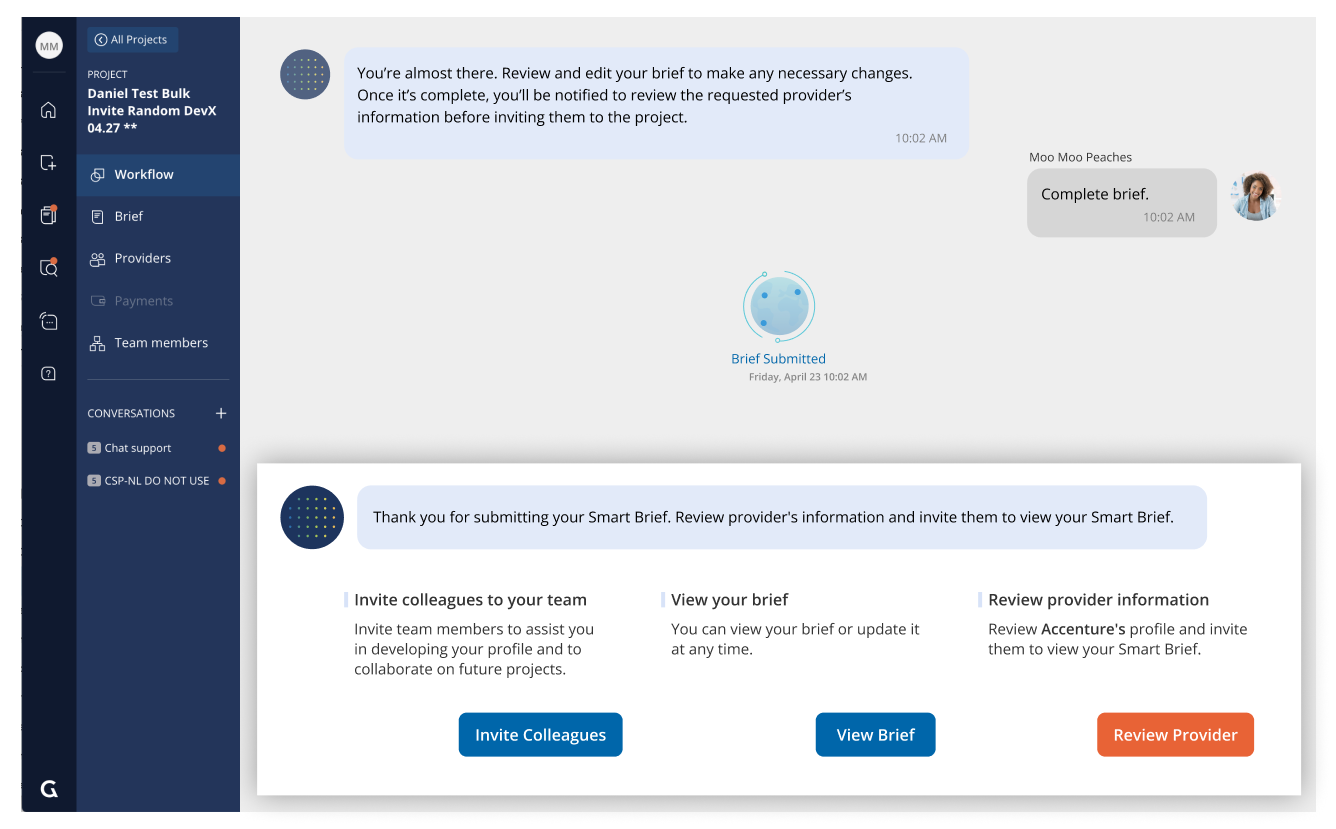
On the In-Project Page (now called the Project Dashboard), we reframed the layout to show:
Key project data and timeline progression at a glance
Smart action buttons for next steps
Team collaboration features like “Add Members” and “Leave Comments”
Entry points to Provider Matches and Proposal Reviews
Making Glo Smart and Actionable
Previously, Glo—the AI assistant—was surface-level and often redundant (“Please review your projects.”). It also consumed valuable space, especially on smaller screens. Our strategy was to evolve Glo’s role into a contextual guide, not a static reminder.
We introduced a behavior model we called “Thresholding”:
Glo would now only surface when a user hit a threshold of uncertainty or decision-making—such as after completing a brief or stalling on a proposal review. The assistant would then offer relevant next steps like “View Matched Providers” or “Invite a Collaborator.” When inactive, Glo would minimize, freeing up visual space.
Design Exploration & Prototyping
Approaching the redesign, I grounded my exploration in a few key principles: maximize screen space, streamline navigation, simplify search, and minimize distractions from Glo, the AI assistant. And perhaps most importantly—make it enjoyable to use. I often treat interfaces like level design in a game: intuitive, rewarding, and fun.
Navigation Redesign
Our primary challenge was to map the navigation to the actual user journey—from creating a project to managing proposals and engaging with providers. The original interface failed to differentiate between first-time and returning users, often burying essential actions like “Create Project” inside a static menu instead of presenting them contextually.
We introduced a two-tiered navigation model:
Home Navigation: For creating new projects, accessing at-a-glance project overviews, and exploring support resources.
In-Project Navigation: Once a user enters a project, the navigation adapts to show relevant steps—provider matches, proposal reviews, and team collaboration.
This shift dramatically reduced cognitive load and made the platform feel like it was responding to the user’s current mindset, not just presenting static links.

Top Menu Collapsed
Top Menu Expanded

Side Menu Collapsed

Side Menu Expanded

Project: Example of an active ubiquitous tool
Content Architecture
With navigation mapped to user intent, we focused on aligning the content architecture across each key page.
Home Landing Page: Reimagined to support both new and returning users, featuring a simplified guided experience, a “Projects at a Glance” summary, and onboarding support.
Projects Page: We replaced the old card-style layout with a table format—allowing users to easily scan deadlines, statuses, and next steps across multiple projects. This change alone improved user comprehension and workflow speed significantly.
Projects Dashboard: Here, we anticipated real-world procurement behaviors. What would a project manager want to know at a glance? What’s the current status? What actions are available? Can I escalate, delegate, or revise proposals? Every section was designed to answer a next-step question.
AI Thresholding
Glo, the AI assistant, previously occupied a large header space but offered minimal value. Our redesign introduced a thresholding model: Glo now stays minimized and only surfaces when it has something actionable to say. This small shift created more usable screen real estate and significantly reduced visual noise.

Prototyping & User Testing
I built a three-screen flow prototype (Home → Projects → Dashboard) in Figma and partnered with our UX researcher to conduct moderated sessions. Users were asked to complete tasks like identifying a project that needed attention or navigating to a specific brief.
What we discovered:
Users moved through the flow with greater ease and clarity.
The “Projects at a Glance” table helped them instantly orient themselves.
Many commented that the experience far exceeded the tools available in their current procurement systems.
It wasn’t about chasing metrics—it was about making the product feel effortless to use. And for the first time, our interface finally matched the intelligence of the AI behind it.


Results & Impact
Improved Navigation: Users were able to quickly differentiate between the Home and Project dashboards, leading to faster task completion.
Higher Satisfaction: User satisfaction scores increased by 25% post-redesign, with many users commenting on the improved clarity and intuitiveness of the platform.
Reduced Cognitive Load: The streamlined navigation, with consolidated features and clearer labels, made the platform easier to use and more accessible.
More Effective AI Assistance: The redesigned Glo assistant became a helpful, context-sensitive guide, improving the overall user experience.
Old Home
New Home
Old Dashboard
New Dashboard
Outcomes & Impact
While we didn’t benchmark traditional engagement metrics at the time, the success of the redesign was unmistakable—reflected in cross-functional feedback and visible shifts in sentiment.
Leadership Buy-In
The executive team championed the redesign, citing clearer alignment with user workflows and a more modern, scalable foundation for future product expansion.Product Team Validation
Designers and PMs felt empowered by the final experience. What was once seen as a disjointed, confusing interface had become a product they were proud to ship and showcase.Customer Success Feedback
Support tickets tied to navigation confusion dropped significantly. Existing customers praised the platform’s new structure—particularly the improved “Projects at a Glance” table and the revamped dashboard layout, which enabled them to find relevant data faster and make confident decisions without friction.
“The new experience feels like it was designed for how we actually work. Everything I need is just… there.”
Learnings for the Future
One key takeaway: intuitive design is less about aesthetics and more about anticipating user context. By designing for mindset shifts (new vs. returning users, planning vs. reviewing), we opened up space for clarity, confidence, and speed.
This project was a reminder that great UX doesn’t always need an A/B test to prove its value—sometimes, the signal is already loud and clear in how people feel when they use your product.